
Desktop Plugin API
This page is the API reference for trusted Desktop Plugins. To create and build your first plugin, start with Build a Desktop Plugin.
Use the four kernel primitives
The runtime has four primitives. Six contribution families provide concise shortcuts for common product integrations.
Own side effects
Use host.effect for work that has setup and cleanup but no natural React owner:
host.effect(() => {
  const interval = window.setInterval(refreshBoard, 30_000);
  window.addEventListener("online", refreshBoard);

  return () => {
    window.clearInterval(interval);
    window.removeEventListener("online", refreshBoard);
  };
});
Effects, Host-owned subscriptions, and registrations made through the other primitives all belong to the active revision generation. Disable, uninstall, revision replacement, and Desktop shutdown clean them up together.
Compose UI surfaces
Use the three host.ui operations according to the change you need:
| Operation | Composition rule |
|---|---|
add | Keeps every active registration. The surface renders them together. |
replace | Uses the last active registration. Disposing it restores the previous replacement or Core default. |
wrap | Wraps the current surface. A later wrapper is outside earlier wrappers. |
Every call returns a disposable registration and is also generation-owned. Disposing an add removes only that item. Disposing a replace reveals the next active replacement. Disposing a wrap rebuilds the remaining wrapper chain.
An active replacement does not mount the replaced default component tree. Disposing it remounts the current fallback instead of revealing a hidden, still-running implementation.
“Last” and “later” mean actual registration order, including registrations from different plugins.
Use wrap when you need to preserve the current implementation while adding behavior or layout around it:
import type { DesktopPluginSurfaceWrapperProps } from "@dotcraft/plugin";

function ReviewFrame({
  children,
}: DesktopPluginSurfaceWrapperProps<"composer">) {
  return <section className="acme-board-review-frame">{children}</section>;
}

host.ui.wrap("composer", ReviewFrame);
Share services
Use renderer-local services when another plugin needs a callable contract rather than a visual surface:
interface BoardService {
  openCard(id: string): void;
}

host.services.provide<BoardService>("acme-board.board", {
  openCard: (id) => openBoardCard(id),
});

const board = host.services.use<BoardService>("acme-board.board");
board?.openCard("DC-42");
use returns a synchronous snapshot of the last active provider; disposing it reveals the previous provider. Desktop modules may activate concurrently, so resolve cross-plugin services when an interaction needs them and handle undefined. Manifest dependencies require .NET and do not make a Desktop provider activate first. Renderer services do not cross into .NET, CLI, remote clients, or AppServer automatically.
Publish events
Use events for occurrence notifications that do not need a shared service reference:
host.events.on<{ cardId: string }>("acme-board.card-opened", ({ cardId }) => {
  console.log("Opened", cardId);
});

host.events.emit("acme-board.card-opened", { cardId: "DC-42" });
Event listeners are removed with their generation. Events are renderer-local and do not persist Session data or become AppServer notifications.
Target Core surfaces
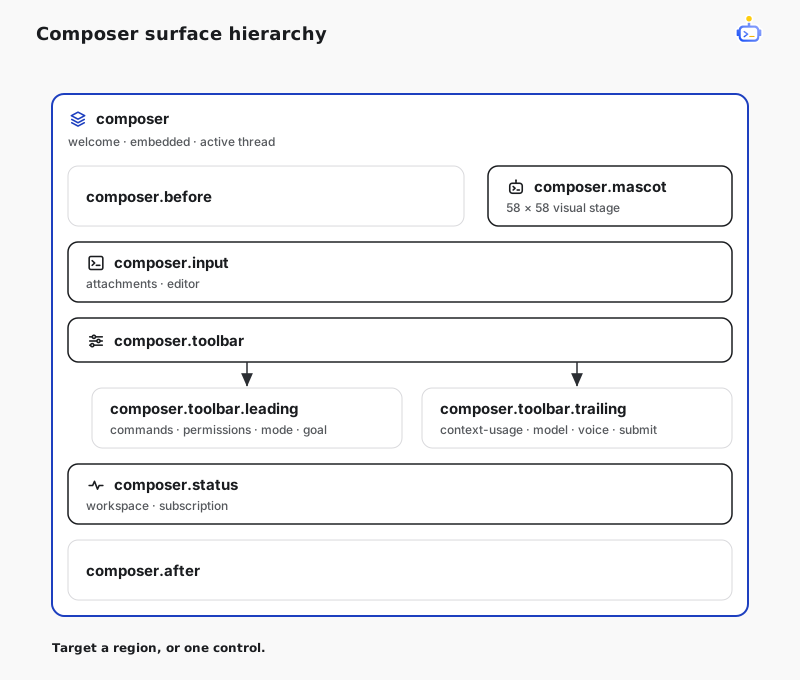
DotCraft's formal surfaces cover the application and Composer. Composer surfaces form a hierarchy, so you can target a complete region or one Core control:
| Surface | Placement |
|---|---|
app | The complete rendered Desktop application. |
app.background | An empty decorative seat behind the application shell; Core's background remains inside app. |
composer | The complete mounted Composer, including new-chat welcome, pre-thread embedded, and active-thread states. |
composer.mascot | The 58 × 58 logical-pixel visual stage for the Composer mascot. |
composer.before | Content immediately before the Composer body. |
composer.after | Content immediately after the Composer shell. |
composer.input | The complete attachment and rich-input region. |
composer.toolbar | The complete control row inside the Composer card. |
composer.toolbar.leading | The leading command, permission, mode, and goal group. |
composer.toolbar.trailing | The trailing context, model, voice, and submit group. |
composer.status | The workspace and subscription row below the Composer card. |
Target these Core controls when a region is too broad:
| Region | Control surfaces |
|---|---|
| Input | composer.input.attachments, composer.input.editor |
| Leading toolbar | composer.toolbar.commands, composer.toolbar.permissions, composer.toolbar.mode, composer.toolbar.goal |
| Trailing toolbar | composer.toolbar.context-usage, composer.toolbar.model, composer.toolbar.voice, composer.toolbar.submit |
| Status | composer.status.workspace, composer.status.subscription |
Core supplies the normal component as each surface's default content. add renders after that content. Use wrap to render before it while preserving its behavior, or replace to remove it and take ownership of the replacement behavior:
import { Button } from "@dotcraft/plugin";
import type {
  DesktopPluginSurfaceProps,
  DesktopPluginSurfaceWrapperProps,
} from "@dotcraft/plugin";

function BeforeModel({ children }: DesktopPluginSurfaceWrapperProps<"composer.toolbar.model">) {
  return (
    <>
      <Button size="sm">Review model</Button>
      {children}
    </>
  );
}

function SubscriptionStatus(_: DesktopPluginSurfaceProps<"composer.status.subscription">) {
  return <span>Review ready</span>;
}

host.ui.wrap("composer.toolbar.model", BeforeModel);
host.ui.add("composer.status.subscription", SubscriptionStatus);
The same names mount in thread, Welcome, approval, and user-input Composers. A surface stays available when its Core default is hidden by the current provider, compact mode, minimal chrome, or decision state. Inspect the shared Composer context before rendering plugin content. A surface name and typed context are public contracts; its generated DOM is not.
Composer surface contexts have threadId: null whenever the Composer has not created or attached to a real Session thread, including welcome and detached embedded Composers. They carry the real thread id after attachment.
| Field | Meaning |
|---|---|
workspacePath | Current workspace path, or null when unavailable. |
threadId | Attached Session thread, or null before attachment. |
mode | Current agent or plan mode. |
busy | The Composer is running, waiting, or performing maintenance. |
awaitingApproval | A host approval decision is active. |
variant | default or an embedded Composer variant such as agentBuilder. |
minimalChrome | Core has hidden nonessential controls for an embedded Composer. |
On the new-chat Welcome screen, composer covers the complete pre-thread composition experience: app selection, hero, input, workspace footer, and quick starts. Replacing it swaps that lifecycle as one unit.
Replace the Composer mascot
Replace composer.mascot with an image, SVG, canvas, Lottie player, or React character. This inline SVG example is self-contained and builds without a separate asset:
import type { DesktopPluginActivate, DesktopPluginSurfaceProps } from "@dotcraft/plugin";

function Mascot({ context }: DesktopPluginSurfaceProps<"composer.mascot">) {
  return (
    <svg
      viewBox="0 0 58 58"
      width={context.size}
      height={context.size}
      data-activity={context.activity}
      role="img"
      aria-label="Acme mascot"
    >
      <circle cx="29" cy="29" r="24" fill="var(--accent)" />
      <circle cx="21" cy="26" r="3" fill="currentColor" />
      <circle cx="37" cy="26" r="3" fill="currentColor" />
      <path d="M20 38 Q29 44 38 38" fill="none" stroke="currentColor" strokeWidth="3" />
    </svg>
  );
}

export const activate: DesktopPluginActivate = (host) => {
  host.ui.replace("composer.mascot", Mascot);
};
Core keeps the mascot's placement, bubble, menu, click handling, sleep timer, Composer handoff, and outer motion. The context inherits the normal Composer fields and adds activity, expression, light, size, submitRevision, reasoningEffort, speed, contextMax, and reducedMotion. React to snapshots directly; watch submitRevision when repeated submissions need a one-shot animation. Use host.events for plugin-defined occurrences.
ui.add("composer.mascot", ...) layers an accessory or effect over the same stage. Replace composer instead when the plugin also needs to own positioning or interaction behavior. composer.mascot does not change the Error Screen mascot or Agent Profile avatars.
Expose a plugin surface
Render PluginSurface inside your component to expose a plugin-owned extension point:
import { PluginSurface } from "@dotcraft/plugin";

declare module "@dotcraft/plugin" {
  interface DesktopPluginSurfaceContextMap {
    readonly "acme-board.card.footer": {
      readonly issueId: string;
    };
  }
}

function BoardCard() {
  return (
    <article className="acme-board-card">
      <h2>DC-42</h2>
      <PluginSurface name="acme-board.card.footer" context={{ issueId: "DC-42" }} />
    </article>
  );
}
Add the custom name to DesktopPluginSurfaceContextMap to type both the owner and every consumer. Provider and consumer packages should import one shared declaration module when they exchange a surface contract. Without declaration merging, an unknown surface receives unknown context. Another enabled plugin can target acme-board.card.footer with ui.add, ui.replace, or ui.wrap; activation order does not matter. Plugin-qualified names are recommended but not enforced.
The surface exists while its component is mounted. Registrations remain owned by their registering revisions and render whenever the surface is present.
Use convenience contributions
Return DesktopPluginActivation when one of the standard product integrations already matches the job:
| Field | Convenience behavior |
|---|---|
mainViews | Adds navigation, routing, and a full view. |
settingsPages | Adds a page to Desktop Settings. |
conversationViews | Adds a thread-scoped tab beside Chat. |
commands | Adds a searchable command with availability and execution. |
toolRenderers | Renders an exact presentationId with Core and generic fallbacks. |
messageActions | Adds an action to the standard assistant-message action area. |
These six fields are convenience APIs, not an allowlist or capability ceiling. Add Composer UI with host.ui.add("composer.toolbar.leading", ...); use surfaces, services, events, and effects when your feature does not fit the convenience fields.
The returned activation may also provide dispose(). Contribution ids must be unique in that activation. Use label.translations for localized labels and order only where the convenience API defines ordered placement.
Use the Host API
Beyond the four primitives, DesktopPluginHost groups stable product operations by owner:
| Member | Use it for |
|---|---|
plugin, environment | Plugin identity plus locale, theme, platform, and workspace context. |
navigation | Views, settings, threads, external URLs, and user notifications. |
appServer | Supported JSON-RPC requests and subscriptions. |
appBindings, appSurfaces | Connected-app binding and app-provided UI surfaces. |
workspaces | Reading local workspace information. |
oratorio | Team runs, handoffs, and events. |
Import shared UI components from @dotcraft/plugin; the official builder connects hooks and JSX to Desktop's React runtime.
The Host API is a compatibility contract, not an access-control boundary. Main-process URL, route, bearer, size, and timeout checks remain service invariants rather than plugin permissions.
Use DOM and CSS deliberately
Desktop Plugins may access the renderer DOM and load global CSS. DotCraft does not block those techniques, but its DOM structure, class names, private CSS variables, stores, and feature components are not public contracts. Prefer a public surface or service when one exists; direct DOM or CSS carries its own maintenance cost.
Keep UI and backend responsibilities separate
A custom background, Composer decoration, wrapper, plugin surface, renderer service, or renderer event needs only a Desktop Plugin. DotCraft does not create matching C# or AppServer APIs for pure UI.
Add a .NET plugin or AppServer contract when the feature needs backend execution, durable host-owned state, Agent tools or hooks, another client, or cross-process and remote coordination. One plugin bundle may contain both modules, but neither is required solely because the other exists.
Generation and reload lifecycle
See DotNetPluginSample for two runnable .NET and Desktop bundles. The Core plugin replaces the background, wraps the app, and owns a renderer service, event, and custom surface; the Consumer adds Composer controls and contributes UI to the Core-owned surface.
Build before DotCraft discovers or packages the plugin. Refresh the plugin list, then enable it. Desktop activates the whole content revision as one generation. An unchanged revision is a no-op; an updated revision disposes the previous generation and activates the new one.
Disabling or replacing a revision withdraws Host-owned registrations immediately. Desktop does not wait for an unfinished plugin activate() or dispose() promise before continuing, and a late activation result cannot publish.
The revision is the development iteration unit. Desktop Plugins do not have a built-in file watcher, HMR, component-only reload, or partial-generation update. Rebuild, then refresh or re-enable the plugin.
Desktop never loads executable plugin code from a remote AppServer. With a remote workspace, it activates only locally packaged code whose plugin id, version, and Desktop content revision match the remote snapshot.