
Desktop Plugin API
This page is the API reference for trusted Desktop Plugins. To create and build your first plugin, start with Build a Desktop Plugin.
Use the four kernel primitives
The runtime has four kernel primitives. Six contribution families build on them with concise shortcuts for common product integrations.
Own side effects
Use host.effect for work that has setup and cleanup but no natural React owner:
host.effect(() => {
  const interval = window.setInterval(refreshBoard, 30_000);
  window.addEventListener("online", refreshBoard);

  return () => {
    window.clearInterval(interval);
    window.removeEventListener("online", refreshBoard);
  };
});
Effects, Host-owned subscriptions, and registrations made through the other primitives all belong to the active revision generation. Disable, uninstall, revision replacement, and Desktop shutdown clean them up together.
Compose UI surfaces
Use the three host.ui operations according to the change you need:
| Operation | Composition rule |
|---|---|
add | Keeps every active registration. The surface renders them together, in order. |
replace | Uses the last active registration. Disposing it restores the previous replacement or Core default. |
wrap | Wraps the current surface. A later wrapper is outside earlier wrappers. |
Every call returns a disposable registration and is also generation-owned. Disposing an add removes only that item. Disposing a replace reveals the next active replacement. Disposing a wrap rebuilds the remaining wrapper chain.
An active replacement does not mount the replaced default component tree. Disposing it remounts the current fallback instead of revealing a hidden, still-running implementation.
“Last” and “later” mean actual registration order, including registrations from different plugins.
Give add an order when the arrangement matters. Additions render in ascending order, and those sharing one — including every addition that omits it, which defaults to 100 — keep registration order among themselves:
host.ui.add("composer.status", ReviewStatus, { order: 50 });replace and wrap stay ordered by registration alone. Their stacking is a disposal contract rather than an arrangement, so an order there would let an early registration outrank a later one permanently.
Use wrap when you need to preserve the current implementation while adding behavior or layout around it:
import type { DesktopPluginSurfaceWrapperProps } from "@dotcraft/plugin";

function ReviewFrame({
  children,
}: DesktopPluginSurfaceWrapperProps<"composer">) {
  return <section className="acme-board-review-frame">{children}</section>;
}

host.ui.wrap("composer", ReviewFrame);
Share services
Use renderer-local services when another plugin needs a callable contract rather than a visual surface:
interface BoardService {
  openCard(id: string): void;
}

host.services.provide<BoardService>("acme-board.board", {
  openCard: (id) => openBoardCard(id),
});

const board = host.services.use<BoardService>("acme-board.board");
board?.openCard("DC-42");
use returns a synchronous snapshot of the last active provider. Disposing that provider takes use back to the previous one. Desktop modules may activate concurrently, so resolve cross-plugin services when an interaction needs them and handle undefined. Manifest dependencies order .NET generations and do not make a Desktop provider activate first. Renderer services do not cross into .NET, CLI, remote clients, or AppServer automatically.
Publish events
Use events for occurrence notifications that do not need a shared service reference:
host.events.on<{ cardId: string }>("acme-board.card-opened", ({ cardId }) => {
  console.log("Opened", cardId);
});

host.events.emit("acme-board.card-opened", { cardId: "DC-42" });
Event listeners are removed with their generation. Events are renderer-local and never write Session data or become AppServer notifications.
Target Core surfaces
DotCraft's formal surfaces cover the application, the Composer, and the active conversation. Composer surfaces form a hierarchy, so you can target a complete region or one Core control:
| Surface | Placement |
|---|---|
app | The complete rendered Desktop application. |
app.background | A Host-owned decorative seat behind the application shell. Render background media here; use host.appearance to control how the shell composes over it. |
app.overlay | An empty seat in front of the application shell, click-through by default. |
app.status | The Host-owned bottom-right status rail for compact persistent diagnostics. The Host owns placement and spacing alongside Core indicators. |
composer | The complete mounted Composer, including new-chat welcome, pre-thread embedded, and active-thread states. |
composer.mascot | The 58 × 58 logical-pixel visual stage for the Composer mascot. |
composer.before | Content immediately before the Composer body. |
composer.after | Content immediately after the Composer shell. |
composer.input | The complete attachment and rich-input region. |
composer.toolbar | The complete control row inside the Composer card. |
composer.toolbar.leading | The leading command, permission, mode, and goal group. |
composer.toolbar.trailing | The trailing context, model, voice, and submit group. |
composer.status | The workspace and subscription row below the Composer card. |
thread.header.actions | The action group in the active thread header, between the overflow menu and the Detail Panel toggle. |
conversation.aside.leading | A seat beside the leading edge of the conversation reading column. |
conversation.aside.trailing | A seat beside the trailing edge of the conversation reading column. |
Target these Core controls when a region is too broad:
| Region | Control surfaces |
|---|---|
| Input | composer.input.attachments, composer.input.editor |
| Leading toolbar | composer.toolbar.commands, composer.toolbar.permissions, composer.toolbar.mode, composer.toolbar.goal |
| Trailing toolbar | composer.toolbar.context-usage, composer.toolbar.model, composer.toolbar.voice, composer.toolbar.submit |
| Status | composer.status.workspace, composer.status.subscription, composer.status.trailing |
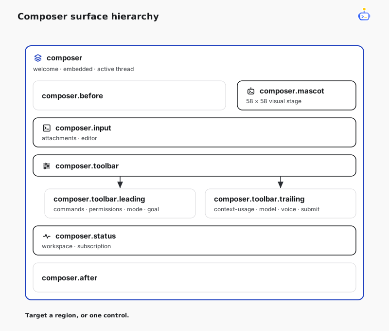
Core supplies the normal component as each surface's default content. add renders after that content. To render before it while keeping its behavior, use wrap. To remove it and own the behavior yourself, use replace:
import { Button } from "@dotcraft/plugin";
import type {
  DesktopPluginSurfaceProps,
  DesktopPluginSurfaceWrapperProps,
} from "@dotcraft/plugin";

function BeforeModel({ children }: DesktopPluginSurfaceWrapperProps<"composer.toolbar.model">) {
  return (
    <>
      <Button size="sm">Review model</Button>
      {children}
    </>
  );
}

function SubscriptionStatus(_: DesktopPluginSurfaceProps<"composer.status.subscription">) {
  return <span>Review ready</span>;
}

host.ui.wrap("composer.toolbar.model", BeforeModel);
host.ui.add("composer.status.subscription", SubscriptionStatus);
Use app.status for a passive status readout that should coexist with DotCraft's own window indicators. Do not position an app.status contribution against the viewport. Use app.overlay for decorative or independently positioned content instead.
The same names mount in thread, Welcome, approval, and user-input Composers. A surface stays available when its Core default is hidden by the current provider, compact mode, minimal chrome, or decision state. Inspect the shared Composer context before rendering plugin content. A surface name and its typed context are public contracts. The DOM the surface generates is not.
The Core names listed above are the complete set. Register under app, composer, thread, or conversation with a name Core does not define and Desktop keeps the registration but writes a console warning naming it, because at that point it is almost always a typo. Names outside those four roots belong to plugins and are never checked: targeting a surface another plugin has not mounted yet is normal, and your component renders as soon as that surface appears.
Composer surface contexts have threadId: null whenever the Composer has not created or attached to a real Session thread, including welcome and detached embedded Composers. They carry the real thread id after attachment.
| Field | Meaning |
|---|---|
workspacePath | Current workspace path, or null when unavailable. |
threadId | Attached Session thread, or null before attachment. |
mode | Current agent or plan mode. |
busy | The Composer is running, waiting, or performing maintenance. |
awaitingApproval | A host approval decision is active. |
variant | default or an embedded Composer variant such as agentBuilder. |
minimalChrome | Core has hidden nonessential controls for an embedded Composer. |
On the new-chat Welcome screen, composer covers the complete pre-thread composition experience: app selection, hero, input, workspace footer, and quick starts. Those elements share one draft and voice lifecycle, so replacing composer swaps them as a single unit.
Place content beside the conversation
thread.header.actions and the two conversation asides mount only while a real Session thread shows its Chat view. They are absent on the new-chat Welcome screen and while a conversation view contribution replaces the message stream. All three share the thread context:
| Field | Meaning |
|---|---|
workspacePath | The thread's workspace, or null for a chat in Chats or when unavailable. |
threadId | The thread on screen. |
busy | A turn is running or waiting for the user's input. |
A thread.header.actions contribution renders one IconButton from the UI kit. The Host owns its spacing, its order next to Core controls, and the header height.
Each aside is a seat between the edge of the message stream and the reading column. It spans the visible stream height and does not scroll with messages. Like app.overlay, the seat is click-through, so set pointer-events: auto on your own interactive elements. The aside context adds layout to the thread context:
| Field | Meaning |
|---|---|
layout | gutter, shift, or overlay, chosen by the Host from the available width. |
width | The seat's current width in logical pixels. |
pin() | Holds room for a panel beside the conversation and returns a dispose. |
The Host picks layout from the side space, which is half the difference between the stream width and the reading column width:
| Layout | Side space | What a trailing pin does |
|---|---|---|
gutter | 400 logical pixels or more | Nothing; the column stays centered. |
shift | From 180 up to 400 logical pixels | Moves the reading column and the Composer 153 logical pixels toward the leading edge. |
overlay | Under 180 logical pixels | Nothing. Show a compact or popover form instead of a panel. |
Call pin from conversation.aside.trailing while your panel is visible, and dispose it when the panel goes away. conversation.aside.leading never pins, and starts after the turn navigation rail while the rail is shown. A layout change animates unless reduced motion is requested, and never remounts your component:
import { useEffect } from "react";
import type { DesktopPluginSurfaceProps } from "@dotcraft/plugin";

function NotesPanel({ context }: DesktopPluginSurfaceProps<"conversation.aside.trailing">) {
  const showPanel = context.layout !== "overlay";
  const { pin } = context;
  useEffect(() => (showPanel ? pin() : undefined), [showPanel, pin]);
  if (!showPanel) return null;
  return (
    <aside style={{ pointerEvents: "auto", width: Math.min(300, context.width - 32), margin: 16 }}>
      Notes for {context.threadId}
    </aside>
  );
}

host.ui.add("conversation.aside.trailing", NotesPanel);
Replace the Composer mascot
Replace composer.mascot with an image, SVG, canvas, Lottie player, or React character. This inline SVG example is self-contained and builds without a separate asset:
import type { DesktopPluginActivate, DesktopPluginSurfaceProps } from "@dotcraft/plugin";

function Mascot({ context }: DesktopPluginSurfaceProps<"composer.mascot">) {
  return (
    <svg
      viewBox="0 0 58 58"
      width={context.size}
      height={context.size}
      data-activity={context.activity}
      role="img"
      aria-label="Acme mascot"
    >
      <circle cx="29" cy="29" r="24" fill="var(--accent)" />
      <circle cx="21" cy="26" r="3" fill="currentColor" />
      <circle cx="37" cy="26" r="3" fill="currentColor" />
      <path d="M20 38 Q29 44 38 38" fill="none" stroke="currentColor" strokeWidth="3" />
    </svg>
  );
}

export const activate: DesktopPluginActivate = (host) => {
  host.ui.replace("composer.mascot", Mascot);
};
Core keeps the mascot's placement, bubble, menu, click handling, sleep timer, Composer handoff, and outer motion. The context inherits the normal Composer fields and adds activity, expression, light, size, submitRevision, reasoningEffort, speed, and reducedMotion. React to snapshots directly; watch submitRevision when repeated submissions need a one-shot animation. Use host.events for plugin-defined occurrences.
ui.add("composer.mascot", ...) layers an accessory or effect over the same stage. Replace composer instead when the plugin also needs to own positioning or interaction behavior. composer.mascot does not change the Error Screen mascot or Agent Profile avatars.
Expose a plugin surface
Render PluginSurface inside your component to expose a plugin-owned extension point:
import { PluginSurface } from "@dotcraft/plugin";

declare module "@dotcraft/plugin" {
  interface DesktopPluginSurfaceContextMap {
    readonly "acme-board.card.footer": {
      readonly issueId: string;
    };
  }
}

function BoardCard() {
  return (
    <article className="acme-board-card">
      <h2>DC-42</h2>
      <PluginSurface name="acme-board.card.footer" context={{ issueId: "DC-42" }} />
    </article>
  );
}
Add the custom name to DesktopPluginSurfaceContextMap to type both the owner and every consumer. Provider and consumer packages should import one shared declaration module when they exchange a surface contract. Without declaration merging, an unknown surface receives unknown context. Another enabled plugin can target acme-board.card.footer with ui.add, ui.replace, or ui.wrap, and activation order does not matter. Plugin-qualified names are recommended but not enforced.
The surface exists while its component is mounted. Registrations remain owned by their registering revisions and render whenever the surface is present.
Use convenience contributions
Return DesktopPluginActivation when one of the standard product integrations already matches the job:
| Field | Convenience behavior |
|---|---|
mainViews | Adds navigation, routing, and a full view. |
settingsPages | Adds a page to Desktop Settings. |
conversationViews | Adds a thread-scoped tab beside Chat. |
commands | Adds a searchable command with availability and execution. |
toolRenderers | Renders an exact presentationId with Core and generic fallbacks. |
messageActions | Adds an action to the standard assistant-message action area. |
These six fields are convenience APIs, not an allowlist or a capability ceiling. Add Composer UI with calls like host.ui.add("composer.toolbar.leading", ...). When a feature does not fit the convenience fields, reach for surfaces, services, events, and effects directly.
The returned activation may also provide dispose(). Contribution ids must be unique within one activation. Put localized labels in label.translations, keyed by app locale. Desktop normalizes both sides of that lookup, so a zh-CN key still reaches a zh-Hans reader, while a key outside the seven locales falls back to label.default. Set order only where the convenience API defines ordered placement.
Give a contribution an icon
mainViews, settingsPages, conversationViews, commands, and messageActions take an optional icon. Pass a component for anything specific to the plugin. It receives size, strokeWidth, aria-hidden, and style, and inherits the surrounding text color through currentColor:
import type { DesktopPluginIconProps } from "@dotcraft/plugin";

function ReviewIcon({ size = 16, ...rest }: DesktopPluginIconProps) {
  return (
    <svg
      width={size}
      height={size}
      viewBox="0 0 24 24"
      fill="none"
      stroke="currentColor"
      strokeWidth="1.7"
      strokeLinecap="round"
      {...rest}
    >
      <path d="M4 6h16M4 12h10M4 18h7" />
    </svg>
  );
}
A component is the only thing icon accepts. Leave icon off when the artwork does not matter to you, and Desktop draws its own fallback glyph so the row never appears blank.
A mainViews icon can also answer hover the way Desktop's own destinations do. Desktop marks each sidebar row and collapsed-rail button with data-nav-icon-host; in your stylesheet, key one short CSS animation off that ancestor's :hover and :focus-visible, move one part of the glyph for 340–720ms, and start and end on the static drawing. The bundled Oratorio plugin's baton is the reference, and specs/architecture/DESIGN.md states the rules under Navigation Icon Motion.
Use the Host API
Beyond the four primitives, DesktopPluginHost groups stable product operations by owner:
| Member | Use it for |
|---|---|
plugin, environment | The plugin's id, version, and display name, plus the current locale, theme, and theme seed, and a change subscription. |
appearance | Generation-owned theme-seed and backdrop-presentation contributions. |
session | The foreground workspace, active thread, mode, and busy state, plus a change subscription. |
subagents | The SubAgents a thread has started, their state, and their completions. |
projectActions | Reading, adding, and running the actions a local project declares. |
navigation | Opening plugin views, Settings pages, threads, files, Detail Panel tabs, and automations, and claiming custom-scheme links. |
ui | Toasts, Host-owned confirmation, color, and folder dialogs, and the three surface operations. |
appServer | Supported JSON-RPC requests and subscriptions. |
mcp | Calling tools on the workspace's MCP servers. |
settings | Reading, mutating, and following this plugin's schema-backed settings. |
appBindings, appSurfaces | Connected-app binding and app-provided UI surfaces. |
workspaces | Reading local workspace information. |
oratorio | Team runs, handoffs, and events. |
The Host API is a compatibility contract, not an access-control boundary. Main-process URL, route, bearer, size, and timeout checks remain service invariants rather than plugin permissions.
Read and mutate plugin settings
Declare a schema beside the manifest and point to it with settings:
{
  "schemaVersion": 1,
  "id": "acme.wallpaper",
  "settings": "./settings.schema.json"
}
The schema uses a fields array. Supported types are text, textarea, number, bool, select, stringList, keyValueMap, and json. Field keys are case-insensitive and unique; defaultValue must satisfy the same validation as a stored value.
{
  "fields": [
    { "key": "fit", "type": "select", "defaultValue": "cover", "options": ["cover", "contain"] },
    { "key": "dim", "type": "number", "defaultValue": 20, "min": 0, "max": 80 }
  ]
}
Read one complete snapshot during activation, then write only the changed fields. unset removes the selected scope's override and reveals the next lower layer:
const snapshot = await host.settings.get();
const current = snapshot.value as { fit: string; dim: number };

await host.settings.mutate("personal", [
  { op: "set", key: "fit", value: "contain" },
  { op: "unset", key: "dim" },
]);
The snapshot contains the schema, personal and workspace layers, the effective value, and writable scopes. Version 1 has no conflict token and no host-generated settings page. Use the settings file only for small JSON values. Keep images, SQLite files, and caches in a plugin backend instead; renderer plugins receive neither a host data-directory path nor a general file API.
Follow settings changes
host.settings.onChange delivers a complete snapshot whenever this plugin's stored settings move:
host.settings.onChange((snapshot) => {
  applySettings(snapshot.value as WallpaperSettings);
});
It fires once per change, whether your plugin wrote it or another client did. A repeat is not a change: a snapshot equal to the last one delivered is dropped, so your own write never comes back a second time as an echo. A rejected mutate leaves the file untouched, so nothing is published and the rejection alone reaches you — keep the optimistic value only until the promise settles.
It never fires on subscribe. Read the value once during activation, keep it, and let onChange replace it from then on:
let settings = normalize((await host.settings.get()).value);

host.settings.onChange((snapshot) => {
  settings = normalize(snapshot.value);
  repaint(settings);
});
Desktop owns the observation and re-reads a plugin's configuration once per change, however many listeners that plugin registered, so subscribing from several places costs nothing extra. Only the newest read is allowed to publish, so writes in quick succession — dragging a slider — never hand a listener the older value even when an earlier read resolves last. Writes that do not go through this API — a hand edit of plugin-config.json while Desktop is running — are not observed.
React to theme and locale changes
host.environment reads the applied theme, its seed, and the UI locale. Subscribe with onChange when something outside React has to follow them — a canvas, a generated stylesheet, or a cached value:
host.environment.onChange(({ locale, theme, themeSeed }) => {
  repaintScene(theme, themeSeed.accent);
  relabelScene(locale);
});
Every call delivers a complete snapshot, and a call happens only when a value actually changed. The subscription is generation-owned, so it goes away with the plugin.
themeSeed carries the four values Desktop derives its palette from — surface, ink, accent, and a 0-100 contrast. Watch it when you paint something CSS cannot reach, such as a canvas: a user changing the accent leaves theme at dark, so the theme name alone would not tell you to repaint. For anything you can style in CSS, read the tokens instead of re-deriving the ramp.
locale is one of Desktop's seven app locales — en, zh-Hans, ja, ko, es, fr, de — typed as DesktopPluginLocale. Desktop normalizes the browser tag first, so a user on zh-CN or en-US reaches your plugin as zh-Hans or en. Key a string catalog by app locale and read host.environment.locale directly; no base-language fallback of your own is needed.
Desktop owns the underlying observation. A plugin does not watch document.documentElement for data-theme or lang, and how Desktop notices a change is not part of the contract.
Inside a React tree, hold the snapshot in state from the same subscription:
import { useEffect, useState } from "react";
import type { DesktopPluginViewProps } from "@dotcraft/plugin";

function useTheme(host: DesktopPluginViewProps["host"]) {
  const [theme, setTheme] = useState(host.environment.theme);
  useEffect(() => {
    setTheme(host.environment.theme);
    return host.environment.onChange((environment) => setTheme(environment.theme));
  }, [host]);
  return theme;
}
Contribute a theme or backdrop presentation
Application-wide appearance goes through host.appearance. A theme plugin can override only the seed fields it owns for either variant; Core Appearance settings remain the base layer:
host.appearance.setThemeSeedOverride({
  light: { surface: "#f7f2e8", ink: "#2d2924", accent: "#b64b3a" },
  dark: { surface: "#171413", ink: "#f3ece7", accent: "#e26a55" },
});
A wallpaper plugin renders its media in app.background, then asks the Host to compose each shell region once over that media:
host.appearance.setBackdropPresentation({ surfaceOpacity: 0.72 });Each plugin generation owns one slot of each kind. A later activation has priority without discarding the earlier contribution; passing null, disabling, uninstalling, reloading, or failing activation reveals the previous layer. Repeating the same value does not publish another theme change. Desktop validates seed colours and constrains contrast and opacity.
These calls do not persist plugin choices. Store the chosen pack or opacity with host.settings, reapply it during activation, and pass null when the effect is off. Do not set Desktop's private CSS variables or wrap app to create a global appearance effect.
Read the current session
host.session reports what Desktop is working on, and onChange follows it:
host.session.onChange((session) => {
  repaint(session.busy);
});| Field | Meaning |
|---|---|
workspacePath | The workspace in the foreground, or null when none is open. |
threadId | The active thread, or null on the welcome screen. |
mode | agent or plan. |
busy | A turn is running or waiting for the user's input. |
workspacePath is the foreground workspace, not the active thread's. That is what makes it readable from a Settings page, a main view, or an effect with no component mounted anywhere — the places where the conversation panel does not exist. It matches the active entry of host.workspaces.listLocalProjects(). Inside a Composer surface, context.workspacePath still reports the thread's own workspace, which can differ from the foreground one.
Approval state, Composer variant, and minimal chrome are not here. They describe how the Composer presents itself, so they stay on the Composer surface context.
The four fields read live, so a component keeps what it needs in state rather than holding the object:
const [busy, setBusy] = useState(host.session.busy);
useEffect(() => {
  setBusy(host.session.busy);
  return host.session.onChange((session) => setBusy(session.busy));
}, [host]);
Follow SubAgents
host.subagents reads the SubAgents Desktop tracks for a parent thread, the same ones its Subagents tab lists. list returns a snapshot. onChange sends the complete list again whenever a child's identity, state, or summary changes:
const render = (agents: readonly DesktopPluginSubAgent[]) =>
  repaint(agents.filter((agent) => agent.state === "working").length);

render(host.subagents.list(threadId));
host.subagents.onChange(threadId, render);| Field | Meaning |
|---|---|
parentThreadId | The thread that started the SubAgent. |
childThreadId | The SubAgent's own thread. |
agentPath | Its agent path, or null when unknown. |
nickname | The name the Subagents tab shows. Pass it to AgentAvatar. |
state | working, waiting, done, failed, or cancelled. |
summary | A preview of its latest message, or null before Desktop has read one. |
waiting means the SubAgent's active turn needs approval or user input. done covers a SubAgent that completed or was closed.
reveal(parentThreadId, childThreadId) opens the parent thread's Subagents tab with that SubAgent selected.
Open product destinations
host.navigation opens Desktop destinations:
| Method | Opens |
|---|---|
openMainView(id), openSettingsPage(id) | One of this plugin's own main views or Settings pages. |
openThread(threadId, workspacePath?) | A thread, switching workspace when needed. |
openFile(path) | A workspace file in the Detail Panel file viewer. A relative path resolves against the current thread's workspace. |
openDetailPanel(tab) | The current thread's Detail Panel on changes, plan, or subagents. |
openAutomation(automationId) | That automation in the Automations view. |
openExternal(url) | An http(s) URL in the user's default browser, or a dotcraft: link inside Desktop. Other schemes are rejected. |
openPath(path, options?) | A local file or folder in another installed app. See Open a path in another app. |
Open a path in another app
listOpenTargets() returns the apps the user can open local paths in, such as VS Code, File Explorer, or a custom app from Desktop.CustomFileHandlers, as { id, label, icon? }. icon is an image data URL.
openPath(path, { target?, line?, column? }) opens the path in the app whose id is target. Without target, it uses the app the user picked for the current project. line and column move editors that accept a position to that spot. A relative path resolves against the current thread's workspace. Both methods reject in a remote workspace, and openPath rejects when the target is not available.
const targets = await host.navigation.listOpenTargets();
const vscode = targets.find((target) => target.id === "vscode");
await host.navigation.openPath("src/app.ts", { target: vscode?.id, line: 42 });
Run project actions
host.projectActions reads and runs the actions a local project declares in .craft/environments/*.json, the same ones the Summary's Environment section shows. In a remote workspace its methods reject and onChange never fires.
list(workspacePath) returns { environments, selectedEnvironmentId }. Each environment has an id, a name, its file path, isDefault, and its actions for this platform as { id, name, icon, command }, most recently run first. icon is tool, run, debug, or test. An environment that can't be used has an error with the reason and no actions. onChange(workspacePath, listener) delivers the same result when a file, the selection, or the run order changes.
| Method | Effect |
|---|---|
select(workspacePath, environmentId) | Makes that environment the selected one for the project. |
run({ threadId, environmentId, actionId }) | Opens or focuses that thread's terminal tab for the action, titled with its name, and restarts it to run the command. |
openTerminal({ threadId }) | Opens a terminal tab at the workspace root. |
promptAddAction({ workspacePath, environmentId? }) | Opens Desktop's add-action dialog for that environment, or the selected one. Without any environment it creates .craft/environments/environment.json. Resolves to { environmentId, action }, or null when the user cancels or the action is for another platform. |
const { environments, selectedEnvironmentId } = await host.projectActions.list(workspacePath);
const selected = environments.find((environment) => environment.id === selectedEnvironmentId);
const primary = selected?.actions[0];
if (selected && primary) {
  await host.projectActions.run({ threadId, environmentId: selected.id, actionId: primary.id });
}
Start a chat with a prefilled message
A dotcraft://threads/new link opens Desktop's new-chat screen with a message waiting in the composer:
dotcraft://threads/new?path=<folder>&prompt=<message>| Parameter | Effect |
|---|---|
path | Optional. An absolute folder on the Desktop machine. Desktop adds it to the project list if needed and selects it. When the folder does not exist, the current project stays selected. |
prompt | Optional. Text placed in the composer. Desktop never sends it, so the user can edit it first. |
The chat is created only when the user sends. Encode both values. From a plugin, pass the link to openExternal:
const folder = await host.ui.pickFolder({ title: "Choose a project folder" });
if (folder) {
  const link = new URL("dotcraft://threads/new");
  link.searchParams.set("path", folder);
  link.searchParams.set("prompt", "Summarize this project");
  await host.navigation.openExternal(link.href);
}
The same link works from outside Desktop, for example from a browser or another app.
Call MCP tools
host.mcp.callTool calls a tool on one of the workspace's MCP servers and returns the tool's MCP result: content, plus structuredContent, isError, and _meta when the tool sets them.
const result = await host.mcp.callTool({
  server: "board",
  tool: "list_items",
  arguments: { status: "open" },
});
if (!result.isError) showItems(result.structuredContent);
The call follows the same approval and hook rules as a tool the agent calls. Without threadId, it runs outside any conversation and adds nothing to the user's chats, so a tool that needs approval is refused and the refusal comes back as the result. To let the user approve, pass the thread they are looking at, such as host.session.threadId.
Use the UI kit
Import shared UI components from @dotcraft/plugin so a plugin page looks like the rest of Desktop without copying Core styles. The official builder connects hooks and JSX to Desktop's React runtime.
| Group | Components |
|---|---|
| Controls | Button, IconButton, Menu, Input, Textarea, Select, SegmentedControl, Combobox, Checkbox, PillSwitch, Slider |
| Presentation | Spinner, Skeleton, ActionTooltip, ModalHeader, InlineDiff, AgentAvatar |
| Settings layout | SettingsPanelShell, SettingsBreadcrumb, SettingsGroup, SettingsRow |
AgentAvatar draws the character Desktop shows for an agent. Pass the SubAgent's nickname as name, plus an optional size and animated, and your plugin draws the same character as the Subagents tab. Desktop supplies the component, so do not bundle the avatar package yourself.
A control that reports a chosen value — Select, Combobox, SegmentedControl — calls onValueChange and takes its accessible name from ariaLabel. A boolean toggle — Checkbox, PillSwitch — calls onChange.
Slider calls onValueChange while its value moves and calls the optional onValueCommit once when the pointer or keyboard interaction ends. Preview from onValueChange; persist from onValueCommit when saving each intermediate value would perform I/O. Provide valueText when the number needs a unit. Use SettingsRow with orientation="block" for controls that need the row width. For a custom visual picker, use a block row or SettingsGroup flush so it keeps the standard Settings spacing and border while owning its internal layout. htmlFor connects a row label to a native control, and align="flex-start" aligns multiline inline rows at the top.
Reach for SegmentedControl when a few mutually exclusive choices fit on one row, and for Select when the list is longer or each option needs a description or icon:
import { SegmentedControl, SettingsGroup, SettingsRow } from "@dotcraft/plugin";

function DensityRow({
  density,
  onDensityChange,
}: {
  density: "cozy" | "compact";
  onDensityChange: (density: "cozy" | "compact") => void;
}) {
  return (
    <SettingsGroup title="Board">
      <SettingsRow
        label="Density"
        control={
          <SegmentedControl
            value={density}
            options={[
              { value: "cozy", label: "Cozy" },
              { value: "compact", label: "Compact" },
            ]}
            onValueChange={onDensityChange}
            ariaLabel="Board density"
          />
        }
      />
    </SettingsGroup>
  );
}
Show a menu
Wrap a trigger, usually an overflow IconButton, in Menu to open a Desktop menu from it. Desktop places the menu, handles arrow keys and Escape, and closes it when the user clicks elsewhere. Each item calls onSelect. { type: "separator" } draws a divider, and { type: "label", label } draws a group heading.
import { IconButton, Menu } from "@dotcraft/plugin";
import { MoreIcon } from "./icons";

function RowActions({ onOpen, onRemove }: { onOpen: () => void; onRemove: () => void }) {
  return (
    <Menu
      items={[
        { label: "Open", onSelect: onOpen },
        { type: "separator" },
        { label: "Remove", onSelect: onRemove, danger: true },
      ]}
    >
      <IconButton icon={<MoreIcon size={16} />} label="More actions" />
    </Menu>
  );
}
Items also accept icon and disabled. Give each item of a set of choices checked to show which one is current.
Request a color
Use host.ui.pickColor for an opaque RGB choice. Desktop owns the compact dialog, portal, focus trap, localization, Hex validation, and keyboard controls. It accepts three- or six-digit Hex input and returns a normalized lowercase #rrggbb. Changes preview inside the dialog only.
const result = await host.ui.pickColor({
  title: "Choose workspace color",
  description: "Used wherever this workspace appears.",
  initialColor: "#8b5cf6",
  allowReset: true,
  defaultColor: "#4566cc",
});

if (result.kind === "select") await save(result.color);
if (result.kind === "reset") await clearOverride();
Done returns select. Reset returns reset and closes immediately. Escape, the close button, the backdrop, a competing picker request, or plugin disposal return cancel. Invalid Host arguments reject with TypeError. Do not render a native input[type="color"] or implement a plugin-owned color dialog.
Request a folder
Use host.ui.pickFolder to let the user choose a folder on the Desktop machine. It opens the system folder dialog with your title and resolves to the folder's absolute path, or null when the user cancels. Pass a title that is already in the user's language.
const folder = await host.ui.pickFolder({ title: "Choose a project folder" });
if (folder) await save(folder);
Use bundled assets
Import an image from plugin source and use the value as it comes. The builder resolves it to the URL of the emitted file, so it is already correct at module scope, from the entry bundle, and from a split chunk:
import scene from "./assets/aurora.svg";

function Background() {
  return <div style={{ backgroundImage: `url("${scene}")` }} />;
}
Desktop serves a plugin from dotcraft-plugin://<id>/source/<source>/<revision>/, an address that no build can know in advance, so there is nothing to repair by hand. Wrapping the import in new URL(asset, import.meta.url) is now redundant rather than wrong: a plugin that still does it keeps working after a rebuild, because the value it wraps is already absolute.
The builder bundles .gif, .jpg, .jpeg, .png, .svg, and .webp into dist/assets/. In CSS, keep the ordinary relative form — url("./assets/aurora.svg") — because a stylesheet resolves it against its own address, which is already under the plugin route.
Use the theme tokens
Desktop derives its whole palette from a four-value seed, and the tokens below are the part a plugin may read. Style with them and your UI follows the user's theme, accent, background, and contrast without watching anything:
.my-plugin-card {
  background: var(--bg-elevated);
  color: var(--text-primary);
  border: 1px solid var(--border-default);
  border-radius: var(--control-radius-md);
  box-shadow: var(--shadow-level-2);
}| Family | Tokens |
|---|---|
| Surfaces | --bg-primary, --bg-secondary, --bg-tertiary, --bg-active, --bg-hover, --bg-elevated |
| Text | --text-primary, --text-secondary, --text-dimmed, --text-tertiary, --text-disabled |
| Borders | --border-subtle, --border-default, --border-active |
| Accent | --accent, --accent-hover, --on-accent |
| Status | --success, --warning, --error, --info, --success-bg, --warning-bg, --error-bg |
| Elevation | --shadow-level-1, --shadow-level-2, --shadow-level-3 |
| Type | --font-ui, --font-body, --font-mono, --type-body-size, --type-ui-size, --type-secondary-size, --type-hint-size, --type-heading-size |
| Shape | --control-radius-md, --button-height, --button-height-sm |
| Seed | --seed-surface, --seed-ink, --seed-accent, --seed-contrast |
--on-accent is the foreground that stays legible on the accent, so put text on an accent fill with it rather than picking white yourself. The --seed-* four are the same values host.environment.themeSeed reports; read them only when you paint outside CSS.
Every other custom property is private, including --composer-*, --sidebar-*, --shell-*, --main-surface-*, --glass-*, --tooltip-*, --scrollbar-*, --shimmer-*, --diff-*, and --ansi-*. They move with Desktop's own layout work.
Use DOM and CSS deliberately
Desktop Plugins may access the renderer DOM and load global CSS, and DotCraft does not block either. Its DOM structure, class names, private CSS variables, stores, and feature components are still not public contracts. Prefer a public surface or service when one exists, and expect to carry the maintenance cost of anything you reach through DOM or CSS instead.
Keep UI and backend responsibilities separate
A custom background, Composer decoration, wrapper, plugin surface, renderer service, or renderer event needs only a Desktop Plugin. DotCraft does not create matching C# or AppServer APIs for pure UI.
Add a .NET plugin or AppServer contract when the feature needs backend execution, durable host-owned state, Agent tools or hooks, another client, or cross-process and remote coordination. One plugin bundle may contain both modules, but neither is required solely because the other exists.
Generation and reload lifecycle
Desktop activates the whole content revision as one generation and calls activate once for it. Refreshing an unchanged revision is a no-op. An updated revision disposes the previous generation before activating the new one. The build and refresh steps live in Build a Desktop Plugin.
Disabling or replacing a revision withdraws Host-owned registrations immediately. Desktop does not wait for an unfinished plugin activate() or dispose() promise before continuing, and a late activation result is stale and cannot publish.
The revision is the development iteration unit. Desktop Plugins do not have a built-in file watcher, HMR, component-only reload, or partial-generation update. Rebuild, then refresh or re-enable the plugin.
With a remote workspace, Desktop downloads the installed plugin's Desktop output after you authorize that workspace to run plugin interfaces on this computer. It verifies the existing content revision before loading. The cache is not another plugin installation: configuration and server-side contributions remain in the remote workspace. Future installs and updates use the remembered workspace grant. Revoke it or retry a failed interface from the Plugins page.
Switching workspaces withdraws the previous workspace's extensions. Remote module URLs include a source scope as well as the revision, so plugins must continue resolving assets relative to their own module URL.
If the remote AppServer does not support Desktop artifact delivery, Desktop does not load its plugin interfaces. Update that server to enable them; other remote plugin contributions remain available.